Project McNulty
08 Aug 2016Time is flying and we are cruising as we enter our seventh week (half-way point!) here at Metis. Our third project was focused on classification methods, and we utilized several tools to generate and expore a dataset of our choice.
Given the current insanity of our political climate, I began wondering about how we, as the electorate, could even begin to make sense of the things flying out of our politicans mouths. Could we ever know what they were saying was true?
Enter politifact.com. For the uninitiated, Politifact is dedicated to fact-checking the most significant and newsworthy claims made by politicians, candidates, PACs, bloggers, pundits, analysts, etc. A panel of staffers rank the statements on their scale of “True” to “Pants on Fire!” false. See this page for a more thorough description of their selection and ranking process. They also have an API that makes it easy to interact with their site and pull information on statements as needed.
Central question
After much thought and data exploration I settled on a central question:
Can we predict whether a politician’s statements are true or not, given the demographics of their electorate?
I chose to focus specifically on statements made by senators and governors during their elected tenure.
Data sources
Aside from Politifact’s API, I used the American Community Survey to collect demographic data by year for each state, available through the American Fact Finder. Everypolitician.org was an excellent source of information on all senators. I collected data from Wikipedia on every governor for every state since 2007 (I searched for a central source of this information, but had no luck).
Data merging and analysis
The fuzzy wuzzy module was a lifesaver as far as merging my datasets. For example, Bernie Sanders is referred to as “Bernie” on Politifact’s website, but “Bernard Sanders” in EveryPolitician’s database. I was able to write a function that found the top match for each name, calculated the percent match between them, and then standardized the dataframe to Politifact’s naming scheme based on a set threshold for the percent match.
I ended up with a total of 419 statements, all ranked on the scale of “True” to “Pants on Fire!”, matched to a politician and the demographics of the state the year the statement was made. My dataset was limited to the years 2007-2014, due to the availability of a signficant table provided by the ACS. This is an admittedly small dataset but it was plenty to work with for the scope of the project.
Lies abound
Using seaborn, I first looked at the distribution of the statements that ended up in my dataset.
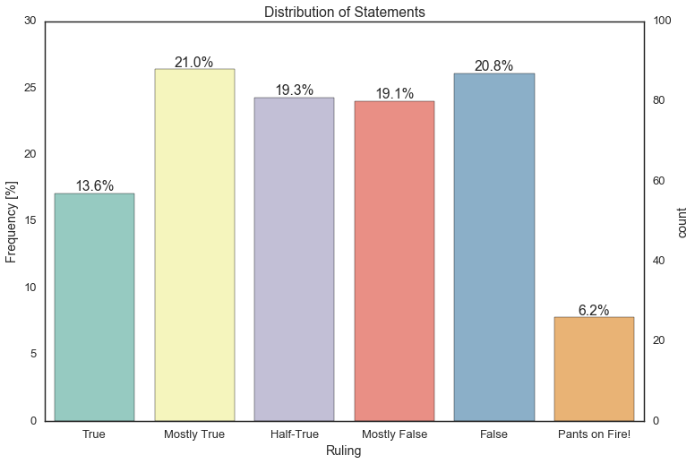
The cynic in me was not suprised: there were more false statements than true! If we categorize “True” and “Mostly True” as True statements and the rest as False, the imbalance is about 40/60. This becomes an important issue later on in model building.
I then looked at the split by the two major parties.
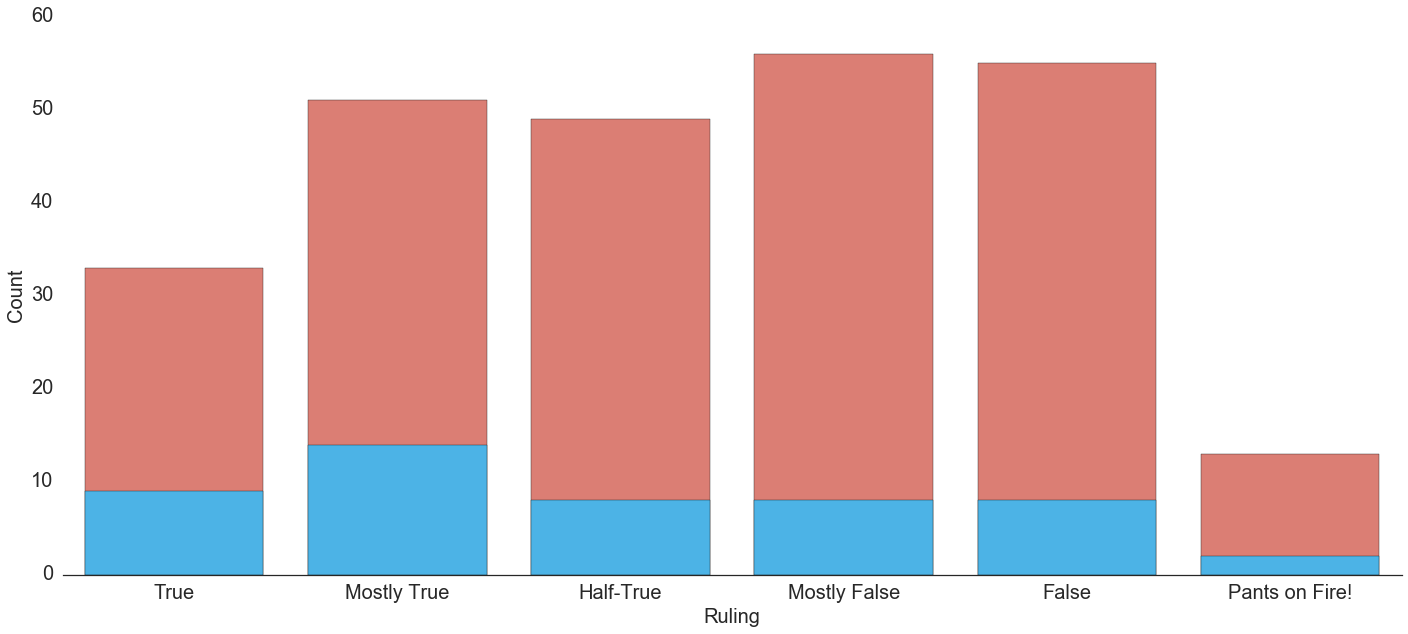
There is a clear selection bias amongst this sample, where there are significantly more Republican statements represented than Democrat. However, looking at the frequency of the statements by party reveals something a bit different.
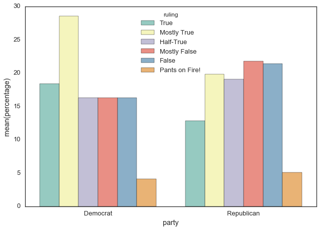
The argument could be made that though sampled more, Republican statements skew more towards being false than Democrat statements.
Predicting the truth
My exploratory analyses revealed an important issue many data scientists run into: class imbalance. I used sklearn and imbalancedlearn to correct for this imbalance in my training set. My outcome was binned into 0 and 1, with 1 representing True, our minority class. My features included year, state (as dummy variables), and state demographic information (such as median household income, percent English speaking, etc). Going into model building, my focus was primarily on precision, rather than recall, because I wanted to be able to accurately predict when a statement was true. Cluster Centroids, an undersampling method, was best at accounting for class imbalance, and an SVM model gave me the highest precision and AUC of all combinations of imbalance adjustment and classification models.
Unfortunately, but not all that surprisingly, it’s tough to predict the truth. When applied to my test set, my model accuracy was 61%, with a precision of 0.4 and an AUC of 60%. I am going to continue work to expand the dataset and refine the model to increase accuracy and precision.
Limits
While this project reveals an interesting and unsurprising truth (the guy on TV is probably lying!), there are a few ways in which this analysis can be strengthened. First on my list is expanding the dataset. I would like to collect demographic information by county so that congresspeople can be included. I also want to account for some of the biases in this sample. The states and politicians are not sampled evenly and so there is some imbalance in the features. For example, Arizona is overrepresented in 2008 because John McCain was campaigning and talking every which way. It may mean breaking up the statements by country region, or creating dummy variables for election year statements. It would also be interesting to look specifically at campaign years, be it for president, senate or house, and see how truthful candidates are.
I had a lot of fun with this project and was happy to have a few aha! moments along the way, where I felt like things really started to click. I’d previously taken a categorical data analysis class, but this helped fill in the gaps and feel more confident in my interpretations. I also really enjoyed learning more about the strengths of sklearn and all the fun ways to slice and visualize data with seaborn.
